Timeline Visualizations
Timeline is a time series data visualizer that enables you to combine independent data sources within a single visualization. It’s driven by a simple expression language you use to retrieve time series data, perform calculations to tease out the answers to complex questions and visualize the results.
For example, Timeline enables you to easily get the answers to questions like:
- What is the real-time percentage of CPU time spent in user space to the results offset by one hour?
- What does my inbound and outbound network traffic look like?
- How much memory is my system using?
Create time series visualizations
To compare the real-time percentage of CPU time spent in user space to the results offset by one hour, create a time series visualization.
- Define the functions
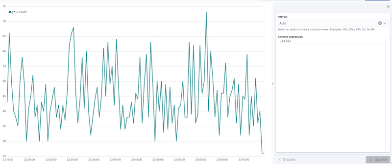
To start tracking the real-time percentage of CPU, enter the following in the Timeline expression field:
.es(index=metricbeat-*, timefield='@timestamp', metric='avg:system.cpu.user.pct')
timeline create01
- Compare the data
To compare the two data sets, add another series with data from the previous hour, separated by a comma:
.es(index=metricbeat-*,
    timefield='@timestamp',
    metric='avg:system.cpu.user.pct'),
  .es(offset=-1h,
      index=metricbeat-*,
      timefield='@timestamp',
      metric='avg:system.cpu.user.pct')
offsetoffsets the data retrieval by a date expression. In this example, -1h offsets the data back by one hour.
3. Add label names
To easily distinguish between the two data sets, add the label names:
.es(offset=-1h,index=metricbeat-*, timefield='@timestamp', metric='avg:system.cpu.user.pct').label('last hour'), .es(index=metricbeat-*, timefield='@timestamp', metric='avg:system.cpu.user.pct').label('current hour')
.label() adds custom labels to the visualization.
4. Add a title
Add a meaningful title:
.es(offset=-1h,
    index=metricbeat-*,
    timefield='@timestamp',
    metric='avg:system.cpu.user.pct')
  .label('last hour'),
.es(index=metricbeat-*,
    timefield='@timestamp',
    metric='avg:system.cpu.user.pct')
  .label('current hour')
  .title('CPU usage over time')
.title() adds a title with a meaningful name. Titles make is easier for unfamiliar users to understand the purpose of the visualization.
5. Change the chart type
To differentiate between the current hour data and the last hour data, change the chart type:
.es(offset=-1h,
    index=metricbeat-*,
    timefield='@timestamp',
    metric='avg:system.cpu.user.pct')
  .label('last hour')
  .lines(fill=1,width=0.5),
  .es(index=metricbeat-*,
      timefield='@timestamp',
      metric='avg:system.cpu.user.pct')
    .label('current hour')
    .title('CPU usage over time')
.lines() changes the appearance of the chart lines. In this example, .lines(fill=1,width=0.5) sets the fill level to 1, and the border width to 0.5.
6. Change the line colors
To make the current hour data stand out, change the line colors:
.es(offset=-1h,
    index=metricbeat-*,
    timefield='@timestamp',
    metric='avg:system.cpu.user.pct')
  .label('last hour')
  .lines(fill=1,width=0.5)
  .color(gray),
.es(index=metricbeat-*,
    timefield='@timestamp',
    metric='avg:system.cpu.user.pct')
  .label('current hour')
  .title('CPU usage over time')
  .color(#1E90FF)
.color() changes the color of the data. Supported color types include standard color names, hexadecimal values, or a color schema for grouped data. In this example, .color(gray) represents the last hour, and .color(#1E90FF) represents the current hour.
7. Make adjustments to the legend
Change the position and style of the legend:
.es(offset=-1h,index=metricbeat-*, timefield='@timestamp', metric='avg:system.cpu.user.pct').label('last hour').lines(fill=1,width=0.5).color(gray), .es(index=metricbeat-*, timefield='@timestamp', metric='avg:system.cpu.user.pct').label('current hour').title('CPU usage over time').color(#1E90FF).legend(columns=2, position=nw)
.legend() sets the position and style of the legend. In this example, .legend(columns=2, position=nw) places the legend in the north west position of the visualization with two columns.
Mathematical function usage
To create a visualization for inbound and outbound network traffic, use mathematical functions.
Define the functions To start tracking the inbound and outbound network traffic, enter the following in the Timeline expression field:
.es(index=metricbeat*, timefield=@timestamp, metric=max:system.network.in.bytes)
Timeline math01
Plot the rate of change
Change how the data is displayed so that you can easily monitor the inbound traffic:
.es(index=metricbeat*, timefield=@timestamp, metric=max:system.network.in.bytes).derivative()
.derivative plots the change in values over time.
Add a similar calculation for outbound traffic:
.es(index=metricbeat*, timefield=@timestamp, metric=max:system.network.in.bytes).derivative(), .es(index=metricbeat*, timefield=@timestamp, metric=max:system.network.out.bytes).derivative().multiply(-1)
.multiply() multiplies the data series by a number, the result of a data series, or a list of data series. For this example, .multiply(-1) converts the outbound network traffic to a negative value since the outbound network traffic is leaving your machine.
Change the data metric
To make the visualization easier to analyze, change the data metric from bytes to megabytes:
.es(index=metricbeat*, timefield=@timestamp, metric=max:system.network.in.bytes).derivative().divide(1048576), .es(index=metricbeat*, timefield=@timestamp, metric=max:system.network.out.bytes).derivative().multiply(-1).divide(1048576)
.divide() accepts the same input as .multiply(), then divides the data series by the defined divisor.
Use conditional logic and track trends
To easily detect outliers and discover patterns over time, modify time series data with conditional logic and create a trend with a moving average.
With Timeline conditional logic, you can use the following operator values to compare your data:
| Operator | Meaning |
|---|---|
| eq | equal |
| ne | not equal |
| lt | less than |
| lte | less than or equal to |
| gt | greater than |
| gte | greater than or equal to |
Define the functions
To chart the maximum value of system.memory.actual.used.bytes, enter the following in the Timeline expression field:
.es(index=metricbeat-*, timefield='@timestamp', metric='max:system.memory.actual.used.bytes')
Timeline conditional01
Track used memory
To track the amount of memory used, create two thresholds:
.es(index=metricbeat-*,
    timefield='@timestamp',
    metric='max:system.memory.actual.used.bytes'),
.es(index=metricbeat-*,
    timefield='@timestamp',
    metric='max:system.memory.actual.used.bytes')
  .if(gt,
      11300000000,
      .es(index=metricbeat-*,
          timefield='@timestamp',
          metric='max:system.memory.actual.used.bytes'),
      null)
    .label('warning')
    .color('#FFCC11'),
  .es(index=metricbeat-*,
      timefield='@timestamp',
      metric='max:system.memory.actual.used.bytes')
    .if(gt,
        11375000000,
        .es(index=metricbeat-*,
            timefield='@timestamp',
            metric='max:system.memory.actual.used.bytes'),
        null)
      .label('severe')
      .color('red')
- Timeline conditional logic for the greater than operator. In this example, the warning threshold is 11.3GB (
11300000000), and the severe threshold is 11.375GB (11375000000). If the threshold values are too high or low for your machine, adjust the values accordingly. if()compares each point to a number. If the condition evaluates to true, adjust the styling. If the condition evaluates to false, use the default styling.
Determine the trend
To determine the trend, create a new data series:
.es(index=metricbeat-*, timefield='@timestamp', metric='max:system.memory.actual.used.bytes'), .es(index=metricbeat-*, timefield='@timestamp', metric='max:system.memory.actual.used.bytes').if(gt,11300000000,
.es(index=metricbeat-*, timefield='@timestamp', metric='max:system.memory.actual.used.bytes'),null).label('warning').color('#FFCC11'), .es(index=metricbeat-*, timefield='@timestamp', metric='max:system.memory.actual.used.bytes').if(gt,11375000000,.es(index=metricbeat-*, timefield='@timestamp', metric='max:system.memory.actual.used.bytes'),null).label('severe').color('red'), .es(index=metricbeat-*, timefield='@timestamp', metric='max:system.memory.actual.used.bytes').mvavg(10)
mvavg() calculates the moving average over a specified period of time. In this example, .mvavg(10) creates a moving average with a window of 10 data points.
Customize formatting
Customize and format the visualization using various functions:
.es(index=metricbeat-*,
    timefield='@timestamp',
    metric='max:system.memory.actual.used.bytes')
  .label('max memory')
  .title('Memory consumption over time'),
.es(index=metricbeat-*,
    timefield='@timestamp',
    metric='max:system.memory.actual.used.bytes')
  .if(gt,
      11300000000,
      .es(index=metricbeat-*,
          timefield='@timestamp',
          metric='max:system.memory.actual.used.bytes'),
          null)
        .label('warning')
        .color('#FFCC11')
        .lines(width=5),
      .es(index=metricbeat-*,
          timefield='@timestamp',
          metric='max:system.memory.actual.used.bytes')
        .if(gt,
          11375000000,
          .es(index=metricbeat-*,
              timefield='@timestamp',
              metric='max:system.memory.actual.used.bytes'),
          null)
        .label('severe')
        .color('red')
        .lines(width=5),
      .es(index=metricbeat-*,
          timefield='@timestamp',
          metric='max:system.memory.actual.used.bytes')
        .mvavg(10)
        .label('mvavg')
        .lines(width=2)
        .color(#5E5E5E)
        .legend(columns=4, position=nw)
.label()adds custom labels to the visualization..title()adds a title with a meaningful name..color()changes the color of the data. Supported color types include standard color names, hexadecimal values, or a color schema for grouped data.lines()changes the appearance of the chart lines. In this example, .lines(width=5) sets border width to 5..legend()sets the position and style of the legend. For this example, (columns=4, position=nw) places the legend in the north west position of the visualization with four columns.