Working with Heatmaps
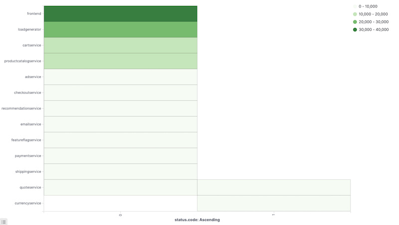
A heat map is a graphical representation of data where the individual values contained in a matrix are represented as colors. The color for each matrix position is determined by the metrics aggregation.
Metrics
The following aggregations are available for this chart:
For an explanation of all available aggreggations see: Metric Aggregations.
Parent Pipeline Aggregations:
For each of the parent pipeline aggregations, you have to define the metric for which the aggregation is calculated. That could be one of your existing metrics or a new one.
You can also nest aggregations, for example, to produce 3rd derivative.
Parent pipeline aggregations available in this visualization include:
Sibling Pipeline Aggregations:
Just like with parent pipeline aggregations, you need to provide a metric for which to calculate the sibling aggregation. On top of that you also need to provide a bucket aggregation which will define the buckets on which the sibling aggregation will run.
You can add an aggregation by clicking the + Add Metrics button.
Enter a string in the Custom Label field to change the display label.
The buckets aggregations determine what information is being retrieved from your data set.
Before you choose a buckets aggregation, specify if you are defining buckets for X or Y axis within a single chart or splitting into multiple charts. A multiple chart split must run before any other aggregations. When you split a chart, you can change if the splits are displayed in a row or a column by clicking the Rows | Columns selector.
This chart’s X and Y axes support the following aggregations.
Enter a string in the Custom Label field to change the display label.
You can click the Advanced link to display more customization options for your metrics or bucket aggregation:
- JSON Input is a text field where you can add specific JSON-formatted properties to merge with the aggregation definition, as in the following example:
{ "script" : "doc['grade'].value * 1.2" }
The availability of these options varies depending on the aggregation you choose.
Options
Basic settings
Select the Options tab to change the following aspects of the chart:
Legend Position allows you to select where to display the legend (top, left, right, bottom).
Check Show tooltips to enable the display of tooltips.
Check Highlight to enable the highlighting of elements with the same label.
Heatmap setting
The Color schema will allow you to select an existing color schema or define your custom colors in the legend. The predefined available color ranges include:
- Green to Red
- Yellow to Red
- Blues
- Greys
- Reds
Reverse color schema reverses the color schema.
Color scale allows you to switch between Linear, Log and Square root scales for color scale.
Scale to data bounds allows you to change the default upper (max) and lower (zero) bounds to match the values returned in the data.
Percentage Mode will show legend values as percentages.
The Number of Colors specifies the number of color buckets to create: Minimum is 2 and maximum is 10.
Custom Range allows you to define custom ranges for your color buckets. For each of the color buckets, you need to specify the minimum value (inclusive) and the maximum value (exclusive) of a range.
Labels
Show Label enables showing labels with cell values in each cell.
Rotate allows rotating the cell value label by 90 degrees.
Overwrite automatic color allows you to override the automatic label coloring by setting a specific color.
Color is enabled if Overwrite automatic color is selected. Here, you can select from a color picker or specify the value in RGB hex codes.