Working with the Goal and Gauge Visualization
The goal visualization displays how your metric value is performing concerning a single, fixed goal. In contrast, a gauge visualization features multiple, predefined ranges and displays where your metric includes the following.
Metric aggregations
Bucket aggregations
Parent pipeline aggregations
For each of the parent pipeline aggregations, you have to define the metric for which the aggregation is calculated. That could be one of your existing metrics or a new one.
You can also nest aggregations, for example, to produce 3rd derivative.
Parent pipeline aggregations available in this visualization include:
Sibling pipeline aggregations
Just like with parent pipeline aggregations, you need to provide a metric for which to calculate the sibling aggregation. On top of that, you also need to provide a bucket aggregation which will define the buckets on which the sibling aggregation will run.
You can add an aggregation by clicking the + Add Metrics button.
Enter a string in the Custom Label field to change the display label.
Open the Advanced link to display more customization options:
JSON Input is a text field where you can add specific JSON-formatted properties to merge with the aggregation definition, as in the following example:
{ "script": "doc['grade'].value * 1.2" }
The availability of these options varies depending on the aggregation you choose.
Options
Click the Options tab to change the following options:
Style
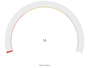
Gauge Type lets you select between arc or circle.
Alignment default is automatic, but you choose either Horizontal or Vertical.
Ranges
Ranges give you the ability to add custom ranges to the arc or circle. Each range will get assigned a color. If a value falls within that range, it will get assigned that color.
Field formatters can be applied to the displayed value causing the range values and the displayed values to be different.
Example: The bytes field formatter applied to the Metrics field will have displayed values like "30MB". The raw value is really closer to 30,000,000. You will need to set your range values to the raw value and not the formatted value.
Percentage Mode will show all values as percentages.
The Auto-extend range extends the range to the maximum in your data.
Color schema lets you define how to color your ranges (which color schema to use). Color options are only visible if more than one range is defined. You have the following color range options:
- Green to Red
- Yellow to Red
- Blues
- Greys
- Reds
Reverse schema reverses the starting color or range.
Show scale shows or hides the scale.
Show outline shows the outline of the gauge or goal.
Show legend shows the legend of the gauge or goal.
Show scale shows the scale marks on the gauge or goal.
Labels
Show Labels will either show or hide the labels.
Sub label is the text for the label that appears below the value.
Display warnings will display a warning if not all labels can be shown.